
Friends, this little hagfish has been on a journey. I found illustrator to be a real challenge, so when I initially drafted my logo, my process was to sit down and work until I came up with something that I liked. I was proud of my first draft, but it did need improvement. I’m grateful to my group members for their helpful, constructive criticism. Their suggestions included:
- Reviewing the image in grayscale
- Checking the size and scalability of my logo, particularly my hagfish
- Using the letter “H” in “Happy” and “Hagfish” a bit more sparingly to combine the phrase
- Changing the shape of the background
I agreed with their suggestions and was looking forward to the opportunity to fix my design. Although I liked my first draft, I knew that there was room for improvement. For example, the square shape of the original logo left a lot of blank space that did nothing to improve the image.
I made a list of what I wanted to preserve in my new draft:
- My happy hagfish
- The text
- The blue background and subtle gradient
- The bubbles
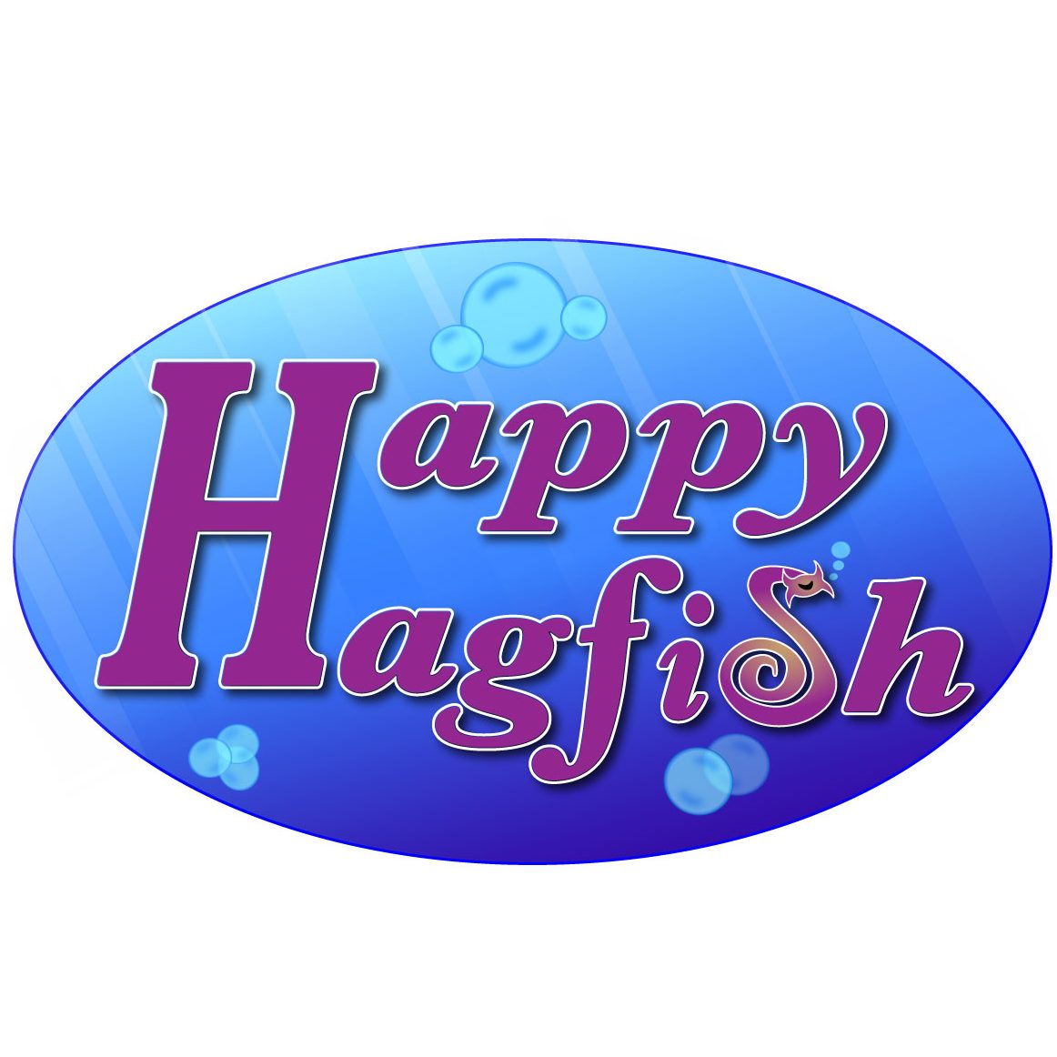
Everything else was open for change. To make my text more visible, I changed the text color to match the purple of the hagfish and the stroke from dark purple to white, which I further altered using Effect => Path => Offset Path. I repeated these steps with the hagfish to give the letters some uniformity.
I made two significant changes to the shape of the logo. First, I created an ellipse and removed some of that blank background space. Second, I deleted the “H” from “Happy” and stretched out the “H” from “Hagfish” so it was large enough for both words. To make everything fit into the new ellipse, I had to do a little letter adjusting, but it all came together nicely, and the look is more cohesive.
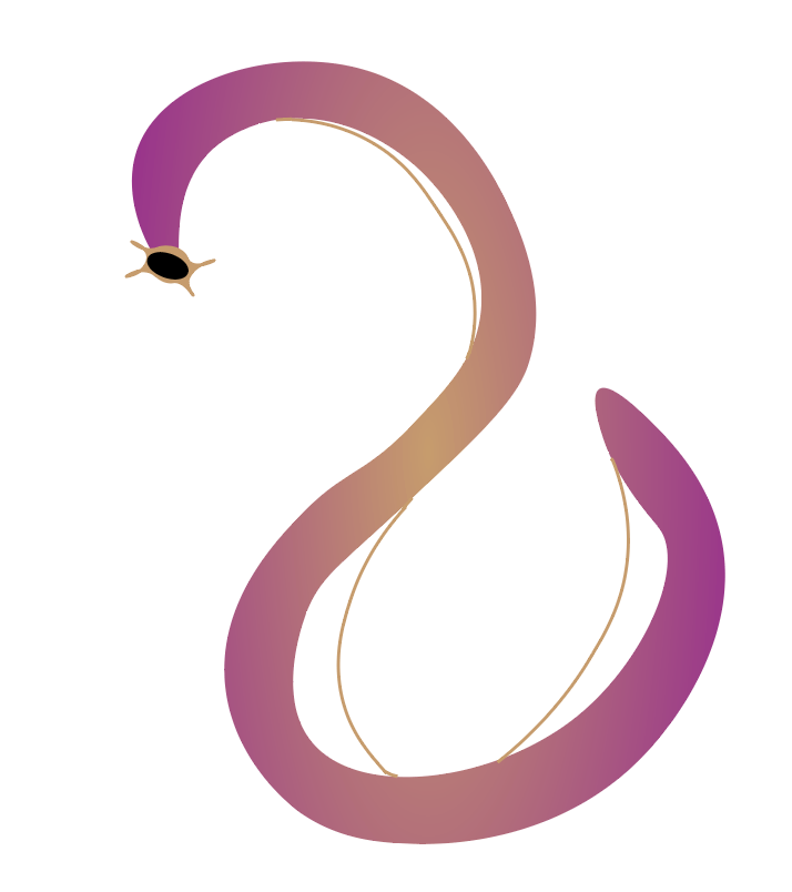
Then it was time for the background. I wanted the background to remind the viewer of the ocean. To do this, I employed a series of effects, including a subtle blue gradient with multiple shades and the addition of a few white, translucent rectangles to represent sunlight. My bubbles also went through a transformation, and not all of them made the final cut. Mr. Hagfish got a few tiny bubbles of his own because I like to think he has a lot to say. I debated adding a little slime to my hagfish but decided against it because I think, for now, he’s happy the way he is. And I’m satisfied with my final result.
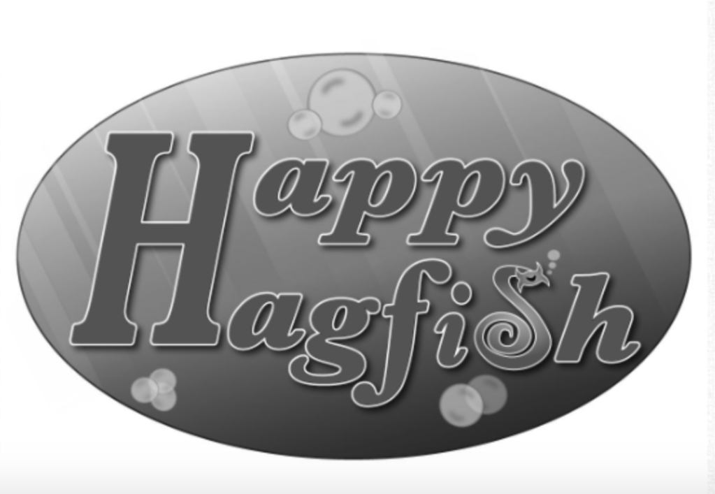
I like the flexibility of the design – if I ever wanted to, I could drop the rest of the “Happy Hagfi-h,” and keep just the Hagfish/S. If I were to render this image in black and white, I would consider removing the blue gradient in the background, but I like how the light appears to shine on the logo. For anyone curious, this is what the design looks like in black and white:
I can envision using my logo in several ways. I could put it on a T-shirt or other merchandise (not that I currently have plans to do so), or I could animate it and make it look like the whole design is floating underwater. If I ever created a TV studio, I could imagine this logo showing up after the credits of every show I made. “Happy Hagfish Productions” does have a nice ring to it.
I went through several iterations of this design, and I’ve included them all below for your enjoyment:
The first-ever hagfish I tried to draw 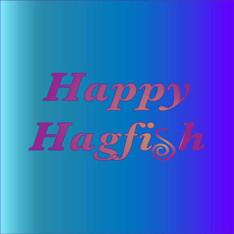
Concept Art – The gradient was wrong and the hagfish was too small 
Concept Art – The gradient still wasn’t quite right 
The original Rough Draft 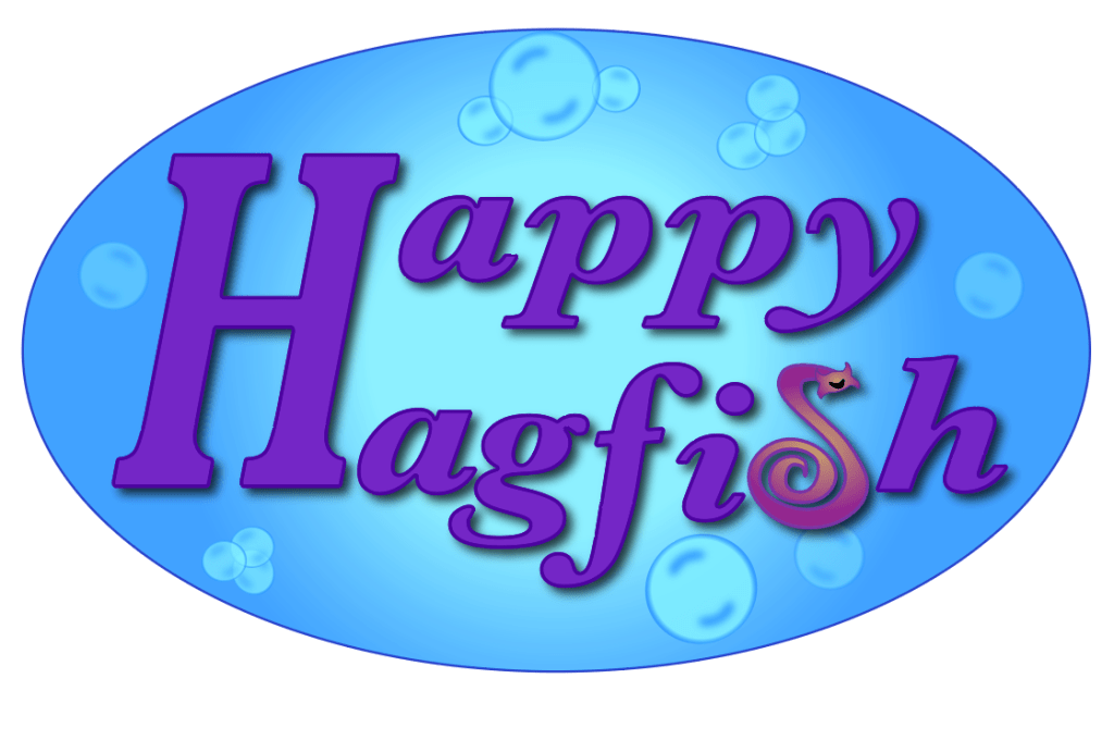
Revised Draft #1 
Revised Draft #2
Note: I didn’t sketch any versions of my logo because I found it easier to work within Illustrator
