Picture this: you’re a freshman at community college, and you have no idea what you want to do with your future. You go to a local career fair to get an idea of your options. Given the unpredictable nature of the economy, you want to start a career in a stable field with opportunities for growth and flexibility. Health insurance is non-negotiable. All you know about accounting is that it’s a field for unhappy nerds.
You walk by booths from different companies advertising various positions, but then you see the following:

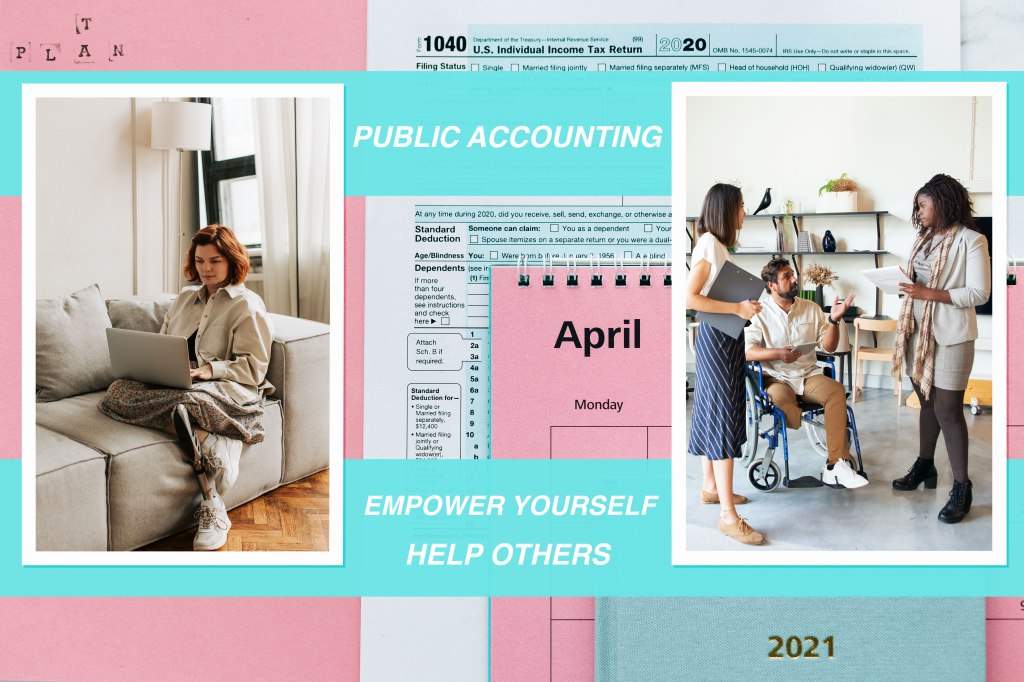
Your eyes are drawn to the three pictures on the poster, standing against a pink and blue backdrop. The images all display people who seem confident, focused, and at ease. Two of the pictures depict people who are physically disabled and at the center of the action, deeply involved in their work. The pictures are warm and inviting. Not a single calculator or pocket-protector insight. You read the text: “PUBLIC ACCOUNTING: REPRESENTING ALL. EMPOWER YOURSELF. HELP OTHERS.” After a moment of thought, you decide you want to learn more.
That is the goal of my design.
With the helpful guidance of my team, I realized there were three factors I needed to address when revising my rough draft:
- The original background was cluttered.
- The text was difficult to read.
- It was unclear that two of the photos contained physically disabled models.
I played around with various images from the artist Nataliya Vaitkevich before deciding on the background. The photograph looks professional, organized, and cheerful. The color palette is, arguably, a little feminine. Accounting is a growing field for women, and as the goal of my image is to challenge preconceptions of accounting, I was determined to keep those colors.
I struggled with the placement of these images. I made a draft of this design with only two images; my goal was to make my text more visible. I eventually decided against the two images, thinking of the rule of three. I needed to clarify that the image was about public accounting and the 1040 form had to be visible. Any person who has ever filed taxes will recognize that form. I reorganized the photos and text placement: I dragged the horizontal shot down to the bottom of the page and moved the order of the text. My original design wasn’t clear enough, so by rearranging the photos and text, I was able to give the overall design a “title.” I also simplified the phrase to “PUBLIC ACCOUNTING: REPRESENTING ALL.” The succinctness of this phrase makes it easier to read and understand while still illustrating my main point: Public Accounting is a diverse, growing field. Lastly, I added a drop shadow to the text to increase visibility against the light blue background.
I kept two photos from my rough draft: the single woman with the prosthetic leg and the couple talking over a financial form. I made no changes to the couple’s photo, but I did edit the single woman. I selected this image because I liked her relaxed posture, comfortable surroundings, and focus. She is “in the zone.” While revising, I made her photo larger within the frame to make her the clear focus of the picture. I applied a combination of the sharpen, sponge, dodge, burn, and blur tools to increase the contrast in the photo.
I debated with myself over the last photograph. My original draft depicted three people working at a conference table, and one of the individuals was a man in a wheelchair. While creating my second draft, I reviewed the artist’s work to see if they had any other images that fit my criteria. The disabled model needed to be prominently staged, not sidelined. I was surprised and somewhat disappointed in my initial search for photographs depicting disability: almost all photos pictured people at special events, like awards ceremonies and charity races. I needed to show disabled people living their daily lives, which includes working. I found a photo of the same models away from the conference table, grouped in conversation. The man in the wheelchair is visible and, most importantly, deeply involved in his teammate’s conversation. He is an equal member of his team.
I want this design to resonate with anyone considering a new career path and open their minds to a possibility they may not have previously considered. I’m happy with my final design, and I hope that it inspires someone.
Photo Resources Below:
- Background (by Nataliya Vaitkevich): https://www.pexels.com/photo/tax-return-form-and-2021-planner-on-pink-surface-6863527/
- Single Woman (by Vlada Karpovich): https://www.pexels.com/photo/woman-relaxation-laptop-house-7153906/
- The group at Office (by Kampus Production): https://www.pexels.com/photo/man-people-woman-creative-6248963/
- Couple (RODNAE Productions): https://www.pexels.com/photo/man-in-brown-crew-neck-t-shirt-sitting-beside-woman-in-beige-long-sleeve-shirt-7821741/
Prior Drafts:

From left to right: My first rough draft and a second rough draft I created after receiving initial feedback
